介绍
详见:https://www.runoob.com/cssref/css3-pr-transform.html
transition过渡属性
过渡效果
第一个属性:指哪些属性有过渡效果,all 表示所有属性
第二个属性:用多长时间完成过渡效果,单位 s
注意:要有触发条件
例子
鼠标悬浮时,宽度从 200px 变换为 400px,高度从 150px 变换为 50px,颜色从 skyblue变换为pink,变换用时 1s
.box{
    width: 400px;
    height: 150px;
    background-color: skyblue;
    transition: all 1s;
}
.box:hover{ /*鼠标悬浮时触发*/
    width: 300px;
    height:300px;
    background-color: pink;
}
<div class="box"></div>
例子2
还是上面例子,宽度有 1s 过渡效果,高度和颜色瞬间完成
.box{
    width: 400px;
    height: 150px;
    background-color: skyblue;
    transition: width 1s;
}
.box:hover{ /*鼠标悬浮时触发*/
    width: 300px;
    height:300px;
    background-color: pink;
}
<div class="box"></div>
例子3
还是上面例子,宽度有 1s 过渡效果,高度有 2s 过渡效果,颜色瞬间完成变换
.box{
    width: 400px;
    height: 150px;
    background-color: skyblue;
    transition: width 1s,height 2s;
}
.box:hover{ /*鼠标悬浮时触发*/
    width: 300px;
    height:300px;
    background-color: pink;
}
<div class="box"></div>
transform
有以下属性值:
- translate(x,y) 移动到水平坐标是x,垂直坐标是y的位置
- scale(x[,y]):2D 缩放转换
- 1个值:指宽度、高度放大倍数
- 2个值:第一个值指宽度放大的倍数,第二个值指高度放大倍数
- rotate(angle) 顺时针 2D 旋转
- skew(x-angle,y-angle) 定义沿着 X 和 Y 轴的 2D 倾斜
translate
- translateX(n):水平移动到 n 坐标。正数往右移动,负数往左移动
- translateY(n):垂直移动到 n 坐标。正数往下移动,负数往上移动
- translate( x , y),移动到水平坐标是x,垂直坐标是y的位置
例子
css:
<style>
    div {
      width: 300px;
      height: 100px;
      background-color: green;
      transition: all 2s;/*过渡效果*/
    }
    div:hover{
        /*移动*/
        transform: translate(50px,30px);
    }
</style>
html:
<div>
</div>
scale
缩放,正数是放大,小数是缩小
例子
设置一个值
css:
<style>
    div {
      width: 50px;
      height: 50px;
      background-color: green;
      /*过渡效果*/
      /* transition: all 2s; */
    }
    div:hover{
        /*放大*/
        transform: scale(2);
    }
</style>
html:
<div></div>
例子2
设置2个值,第一个值表示宽度缩放、第二个值表示高度缩放
css:
.box2{
    width: 300px;
    height: 100px;
    background-color: coral;
    transition: 2s;
}

.box2:hover{
    /* 宽度缩小0.9%,高度放大1.2% */
    transform: scale(0.9,1.2);
}
html:
<div class="box2">box2</div>
rotate
正数,顺时针 2D 旋转;负数,逆时针 2D 旋转
单位:
deg,是degrees(度数)前3个字母,如:45degturn,表示一圈,如:1turn
案例1
https://malaoshi.top/demo/animation/%E5%9C%B0%E7%90%83.html
img{
    width: 480px;
    /*过渡效果*/
    transition: all 20s linear;
}
img:hover{
    /* transform: rotate(360deg); */
    transform: rotate(1turn);
}
<img src="img/diqiu.svg" />
案例2

<style>
    div {
      width: 50px;
      height: 50px;
      background-color: green;
      /*过渡效果*/
      transition: all 2s;
    }
    div:hover{
        /* 旋转45°,注意:要有单位deg*/
        transform: rotate(45deg);
    }
</style>
</head>
<div>盒子1</div>
skew
水平倾斜
第一个值是正数,表示上面往左倾斜,下面往右倾斜
第一个值是负数,表示上面往右倾斜,下面往左倾斜
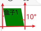
<style>
    div {
      width: 50px;
      height: 50px;
      background-color: green;
      /*过渡效果*/
      transition: all 2s;
    }
    div:hover{
        /*倾斜*/
        transform: skew(10deg,0deg);
    }
</style>
<div>盒子1</div>
垂直倾斜
第二个值是正数,表示左面往上倾斜,右面往下倾斜
第二个值是负数,表示左面往下倾斜,右面往上倾斜
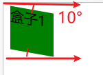
<style>
    div {
      width: 50px;
      height: 50px;
      background-color: green;
      /*过渡效果*/
      transition: all 2s;
    }
    div:hover{
        /*倾斜*/
        transform: skew(0deg,10deg);
    }
</style>
<div>盒子1</div>
参考:
https://www.cnblogs.com/huansky/p/6077166.html