介绍
动画使元素逐渐从一种样式变为另一种样式。
与 2D 转换 transform 不同,可以自动开始,而 transform 需要触发
详见:
https://www.runoob.com/cssref/css3-pr-animation.html
https://www.w3school.com.cn/css/css3_animations.asp
关键帧
为动画指定一些关键帧,从一种效果显示成另一种效果
关键帧包含元素在 特定时间 所的样式。
@keyframes
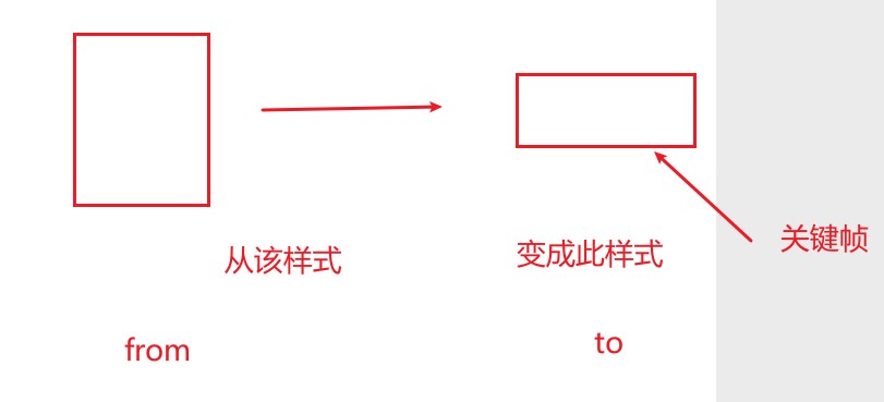
特定时间:
- 使用关键字
from和to表示开始和完成
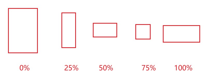
使用百分比值
0%表示开始25%表示完成四分之一50%表示完成一半75%表示完成四分之三100%表示完成
提示:动画结束后,变回最初的样式
animation-name
指定关键帧名字
animation-duration
动画指定需要多少秒或毫秒完成
案例
实现进度条
css:
<style>
    div {
      width: 1px;
      height: 30px;
      background-color: red;
      animation-name: kf;
      animation-duration: 4s;
    }

    /* 关键帧 */
    @keyframes kf {
      from {
        /* 动画开始效果 */
        /* width: 1px; */
      }
      to {
          /* 动画结束效果 */
        width: 200px;
      }
    }
</style>
html:
<div></div>
animation-delay
指定延迟一定时间,再开始动画,单位 s、ms
案例
接上面案例
<style>
    div {
      width: 1px;
      height: 30px;
      background-color: red;
      animation-name: kf;
      animation-duration: 4s;
      /*延迟1秒执行*/
      animation-delay: 1s;
    }

    /* 关键帧 */
    @keyframes kf {
      from {
        /* 动画开始效果 */
        /* width: 1px; */
      }
      to {
          /* 动画结束效果 */
        width: 200px;
      }
    }
</style>
animation-iteration-count
定义动画的播放次数
值:
- 整数,执行次数
infinite:永远执行
animation-timing-function
定义动画效果的速度效果
- linear 动画从头到尾的速度是相同的。
- ease 默认。动画以低速开始,然后加快,在结束前变慢。
- ease-in 动画以低速开始。
- ease-out 动画以低速结束。
- ease-in-out 动画以低速开始和结束。
地球旋转动画
https://malaoshi.top/demo/animation/%E5%9C%B0%E7%90%83-%E5%8A%A8%E7%94%BB.html
img{
    width: 480px;
    /*分开实现*/
    /* animation-name:kf;
    animation-duration:20s;
    animation-iteration-count:infinite;
    animation-timing-function:linear; */
    /*一行代码实现*/
    animation:kf 20s infinite linear;
}

/* 关键帧 */
@keyframes kf {
  from {
  }
  to {
    transform: rotate(1turn); /*转一圈*/
  }
}
<img src="img/diqiu.svg" />
风车旋转动画
html:
<div class="box2">abc</div>
css:
.box2{
    width: 100px;
    height: 100px;
    background-color: cornflowerblue;
    /* 指定kf关键帧 */
    animation-name: kf2;
    /* 动画持续2s完成 */
    animation-duration: 2s;
    /* animation-iteration-count: 2; */
    animation-iteration-count: infinite;
    animation-timing-function: linear;
}
@keyframes kf2{
    from{

    }
    to{
        transform: rotate(360deg);
    }
}